Madruzzo Flat, Trento_Italy
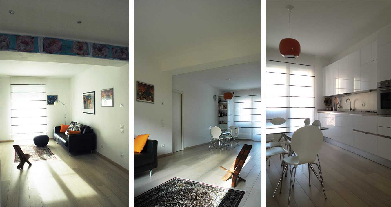
The refurbishment of this small two bedroom apartment in the historic city centre of Trento was done for a young couple whose main desire was to have a nice, spacious and bright place to cook, read, listen to music and entertain. The original layout, typical of 1950’s buildings, was divided into four rooms around a central very dark corridor and was in really bad conditions, but the building orientation and its location with open views were a great asset.
A very simple idea has guided the design: getting rid of all the unnecessary walls and create one main large space which could take advantage of the generous light coming from the double overlooking.
The original parquet was kept, shaved and restored in the two bedrooms, while in the new main dining/ living area the damages where too big and the parquet needed to be substituted.
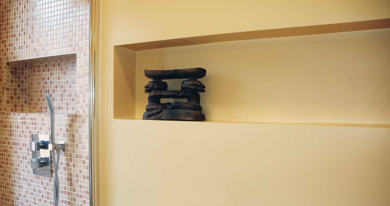
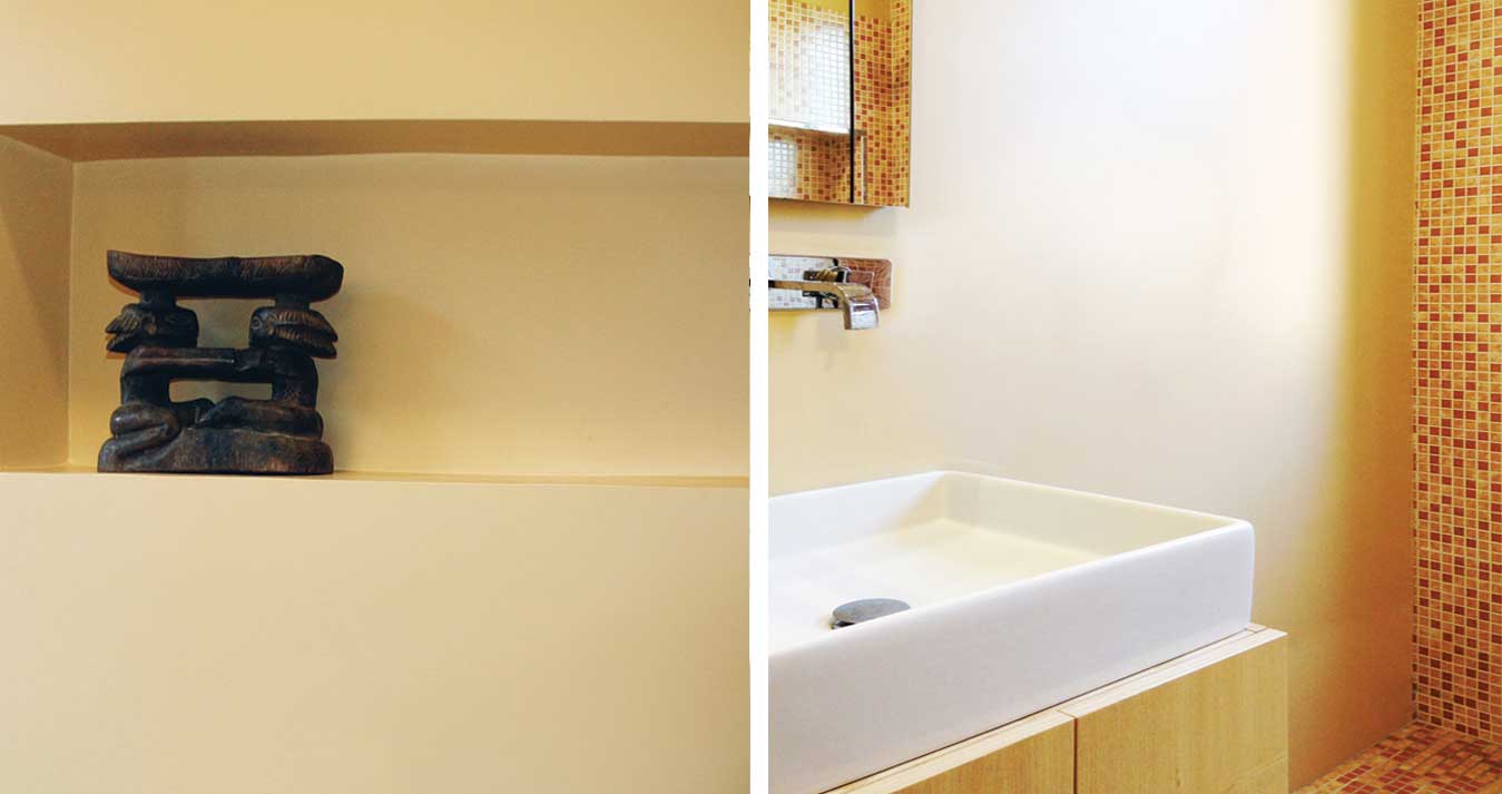
For the bathroom the choice fell on a mix of a mosaic in a palette of earthy colour for the floor and one of the shower walls, and the use of varnish in a caramel nuance for the rest of the room.
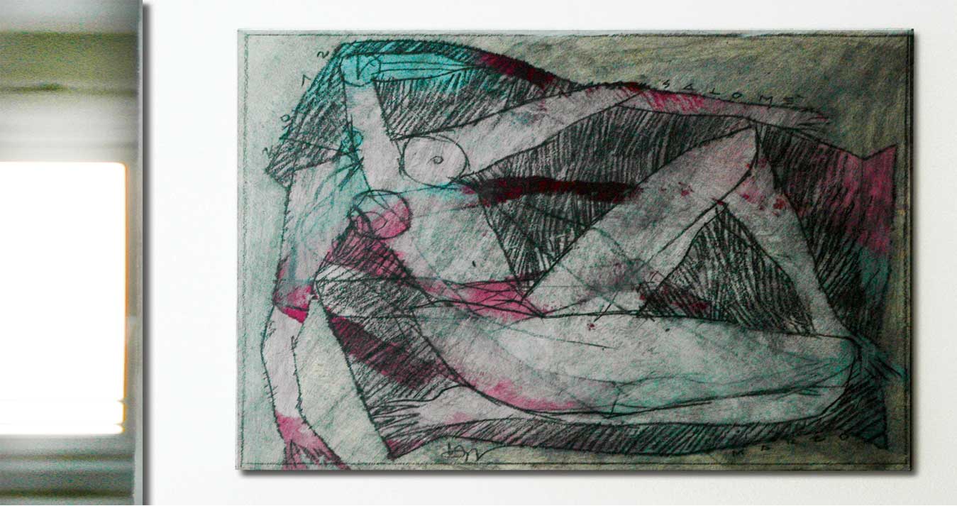
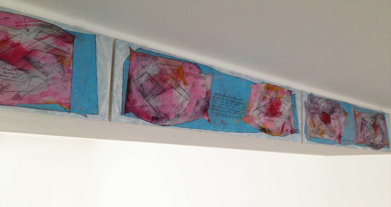
Some features of the flat that could have been visually annoying and could not be removed like stracutural beams and columns were instead turned into key features with the help of the work of the artist Marcello Pola.
- [location] Trento (TN)_Italy
- [status] Completed in 2013
- [program] Interior Refurbishment
- [size] 70mq
- [client] Private Commission
- [architect] Ilaria Di Carlo
- [site direction] Ilaria Di Carlo
- [contractor] Vettorazzi Costruzioni
- [photos] Ilaria Di Carlo
- [works of art] Marcello Pola
Madruzzo Flat, Trento_Italy
The refurbishment of this small two bedroom apartment in the historic city centre of Trento was done for a young couple whose main desire was to have a nice, spacious and bright place to cook, read, listen to music and entertain. The original layout, typical of 1950’s buildings, was divided into four rooms around a central very dark corridor and was in really bad conditions, but the building orientation and its location with open views were a great asset.
A very simple idea has guided the design: getting rid of all the unnecessary walls and create one main large space which could take advantage of the generous light coming from the double overlooking.
The original parquet was kept, shaved and restored in the two bedrooms, while in the new main dining/ living area the damages where too big and the parquet needed to be substituted.
For the bathroom the choice fell on a mix of a mosaic in a palette of earthy colour for the floor and one of the shower walls, and the use of varnish in a caramel nuance for the rest of the room.
Some features of the flat that could have been visually annoying and could not be removed like stracutural beams and columns were instead turned into key features with the help of the work of the artist Marcello Pola.
